Probably my most requested signage request is a seating chart. They can be such a beautiful focal point at your wedding reception and of course they contain the crucial information as to where everyone will sit. This blog post will outline some design considerations for a seating chart so you can have a seating chart everyone will talk about!
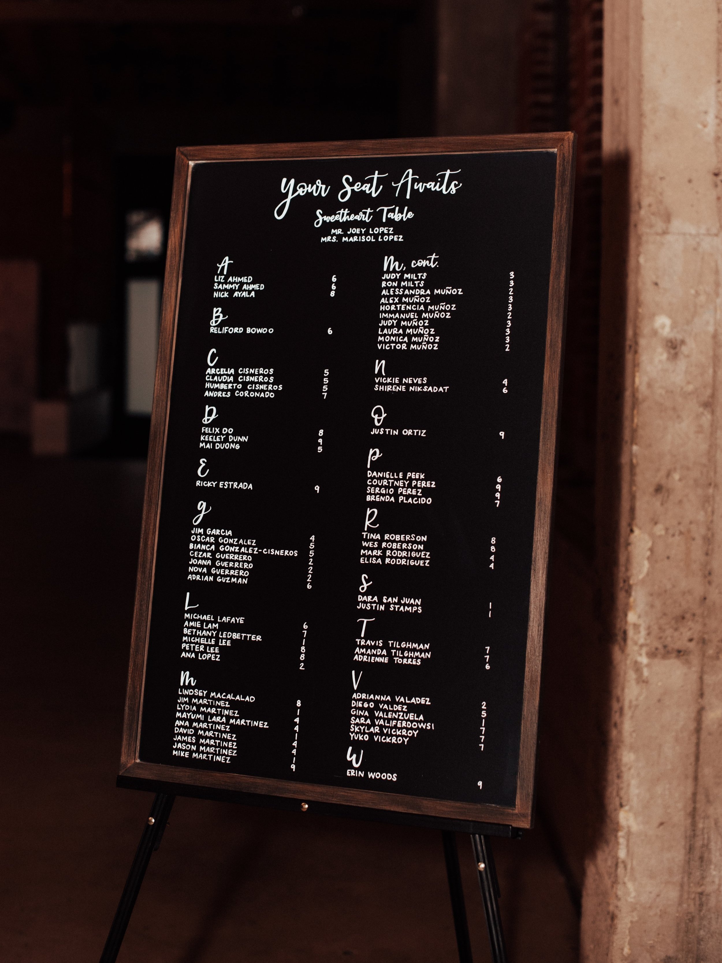
Seating chart on chalkboard; photo by Blessings Photos
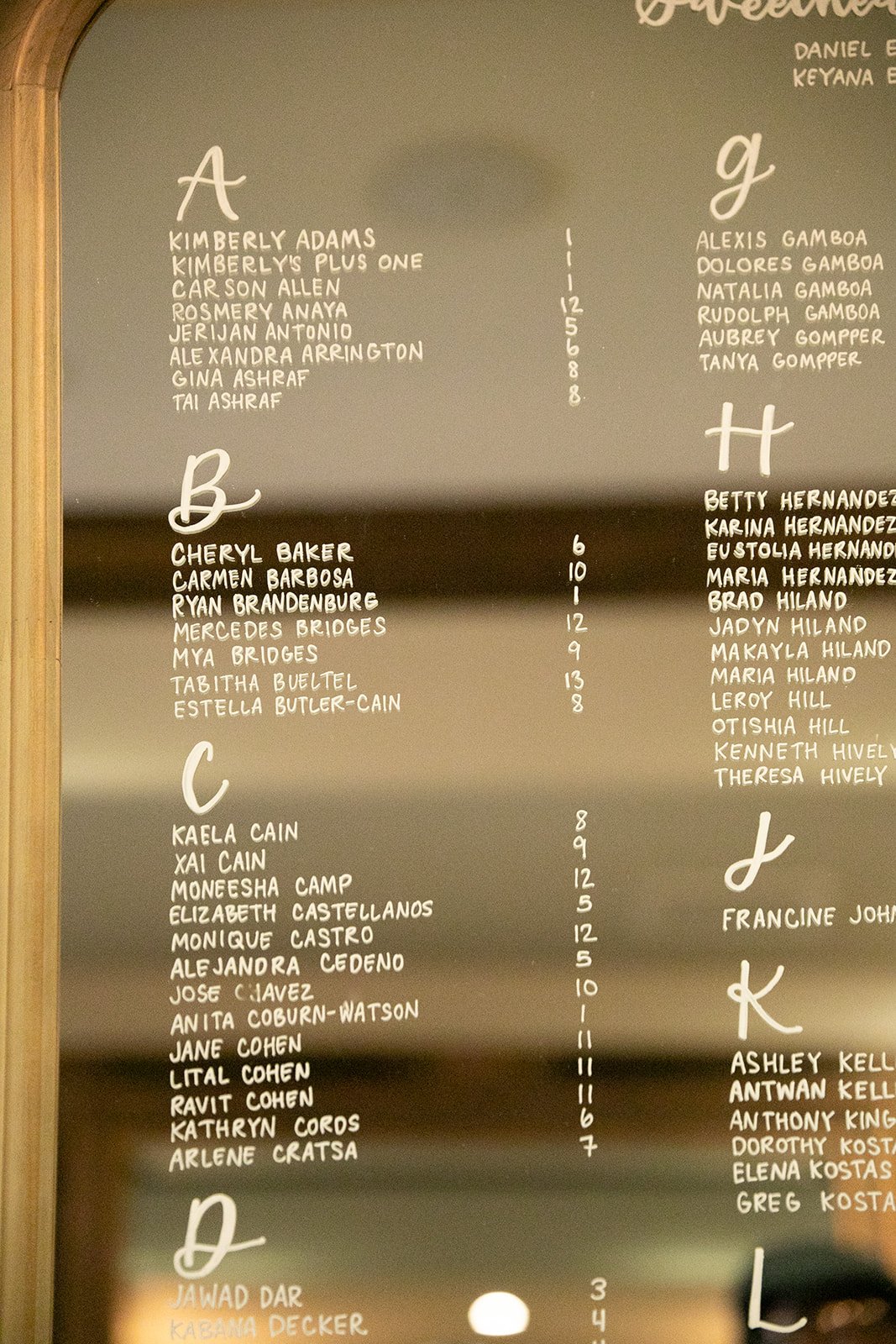
Seating chart on mirror; photo by Jon Bilderback Photography
Material
To start us off - what material do you want your seating chart on? The thing I also like to remind people…what do you plan on doing with the seating chart after the wedding?
A large mirror lends itself really well to a seating chart - it’s gorgeous and the writing will erase after the wedding so you can reuse or sell it. But mirrors can be really heavy so think about how you’ll display it during the wedding.
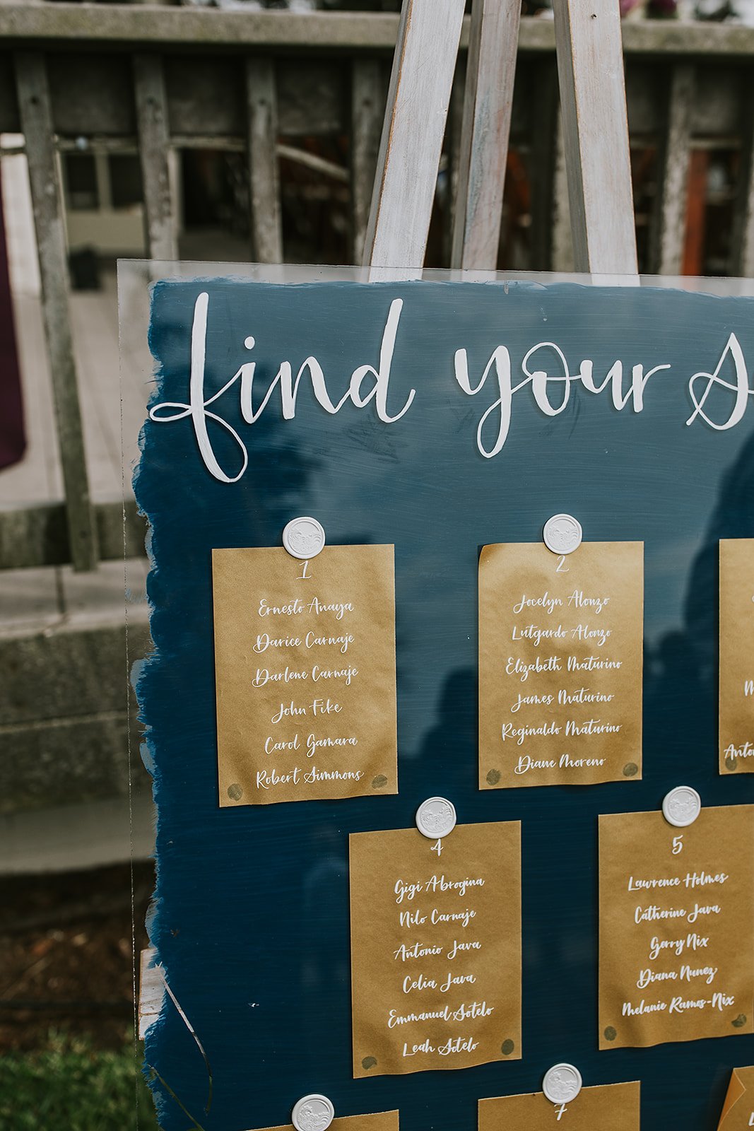
Acrylic is another very popular choice but I won’t lie - I don’t love it. Seating charts are large and what are you going to do with a massive piece of acrylic post wedding? While the writing can be erased, acrylic scratches easily so it *could* be harder to resell or reuse. Acrylic is also more expensive than you think and acrylic is also not good for the environment and will sit in landfills for 200+ years after you throw it out.
A large piece of wood is also a nice choice (design suggestion for this later!) and can be be easily re-purposed or re-sold after the wedding (sand it, cut it down, re-purpose to a large sign - the internet is filled with people who want wood for projects).
While this isn’t a large seating chart sign, you can also do a fun escort card display. Here the material is your escort card (typically paper) displayed on a large board or in some other fun way (champagne flutes anyone?). Read this blog post to learn more about the difference between seating charts vs. place cards. vs. escort cards.
Of course, you don’t have to limit yourself to flat surfaces! Large jugs and vases are becoming increasingly popular and can showcase your unique style. I saw a seating chart bookshelf display on Pinterest once - I think that’s my dream job! Lastly, Some calligraphers may also offer rental mirrors, wood signs, or chalkboards. If your unsure of what material you want, definitely ask your calligrapher as they can figure out what is important to you and help make recommendations.
Close up of seating chart on mirror; photo by Jon Bilderback Photography
Layout
There are 2 ways to list out your guests - alphabetically or by table.
Many of us are drawn to having guests by table; there is something really elegant about it. If you have more than 100 guests, though, this could cause a “traffic jam” as people try to find their names on the list. My recommended layout is always alphabetically, no matter how large or small the guest count is. This layout really helps guests quickly find where they are sitting. You can list names by first name or last name, though my preference is by last name as it’s even more efficient for families.
If you have a lot of guests but want to list the guests by table because you have ideas for fun table names instead of numbers, another option is to stick with an alphabetical layout and table numbers on the seating chart, then on the table number sign at the table, add the table name too.
Size
The size of your chart will depend on the number of guests and how it’s laid out. A “by table” layout will require more space than an alphabetical layout. But you’re not limited to just 1 sign! If you have 2 small mirrors that you love, you can divide the list up among both. Using 2 signs is also ideal for large guest lists, as it will physically space out the guests as they try to find their names.
As mentioned earlier, also think about the size in relation to how you will display the sign. If you plan to have it free-standing (i.e. no easel), consider a taller sign so the bottom can left blank so guests don’t have to bend super low to find their name. Your venue may have suggestions as well as the best place to display your seating chart, and may even have easels for you to borrow.
Design
Seating chart on acrylic with seating chart cards; photo by Grace Day Photography
Now, of course, us calligraphers can, and most often will, write the seating chart directly onto the material. The top of the chart starts with a beautiful calligraphy header - it can be as simple as “find your seat” or something longer that ties to your wedding theme or personality.
For the guest names, it’s best to have these written in clear block letters. You want your guests to be able to easily find their name and move on, and while calligraphy is lovely, tiny written calligraphy could be hard for guests to read. If you are laying your seating chart out by table, then decide if you want these mini-headers written as “Table 1” or “Table One” or even just “1” or “One” - I bet you didn’t know there were so many options! If you are laying your seating chart out by guest name, an initial should be added to divide up the groups (i.e. A, B, C). Depending on the exact size of your seating chart sign and guest list, your calligrapher may group some letters together (i.e. A - C) to ensure everything fits nicely.
Regardless of what material you use though, seating chart cards can be another way to list the table assignments. Here, you can affix the cards to a mirror, wood, etc., with wax seals, florals, or even via a simple clothesline style. Depending on the situation, this can also be more cost effective as it’s always easier to write on paper than any other material and then the material can be more easily re-purposed as it does not have writing on it. And yes, you can do seating chart cards either by table or by name.
I hope this helps answer some questions you had on how best to tackle your seating chart. My last recommendation? Inquire with a calligrapher like me to discuss you vision and come up with an amazing solution with you!

